
Viibe: Branding Case Study
“I had a fantastic experience working with Don and the Redding Communications team on my company’s rebranding initiative….”
Project:
Revitalization of Hayden-Design, a Seasoned Commercial Interior Design Firm
Objective:
Hayden-Design, a distinguished Woman-Owned Business Enterprise, has been a cornerstone in Winston-Salem, NC for over 40 years, specializing in various sectors including healthcare, corporate, education, and more. Under the new ownership of Christine Fariss since 2021, the firm sought to elevate its regional presence while enhancing its brand to mirror the high caliber of its services, ultimately rebranding as “Viibe.”
Challenge:
Despite its stellar reputation, Hayden-Design’s branding elements – including its logo, website, and marketing materials – were outdated and not reflective of the firm’s quality and vision.
Strategy:
Christine Fariss, the new visionary at the helm, partnered with Redding Communications for a transformative rebranding campaign. Aiming for a vibrant, stylish, and technologically adept brand identity, the collaboration focused on creating a cohesive and modern brand image.
Execution:
The rebranding journey began with exploring new names for the firm, each with a unique significance. This process, rich in discussion and iterations, led to the selection and trademarking of “Viibe” as the new name that truly resonated with the firm’s ethos.
Simultaneously, we embarked on developing a contemporary brand color palette. Christine’s preferences were central to this exploration, ensuring the final palette was chosen with full confidence.
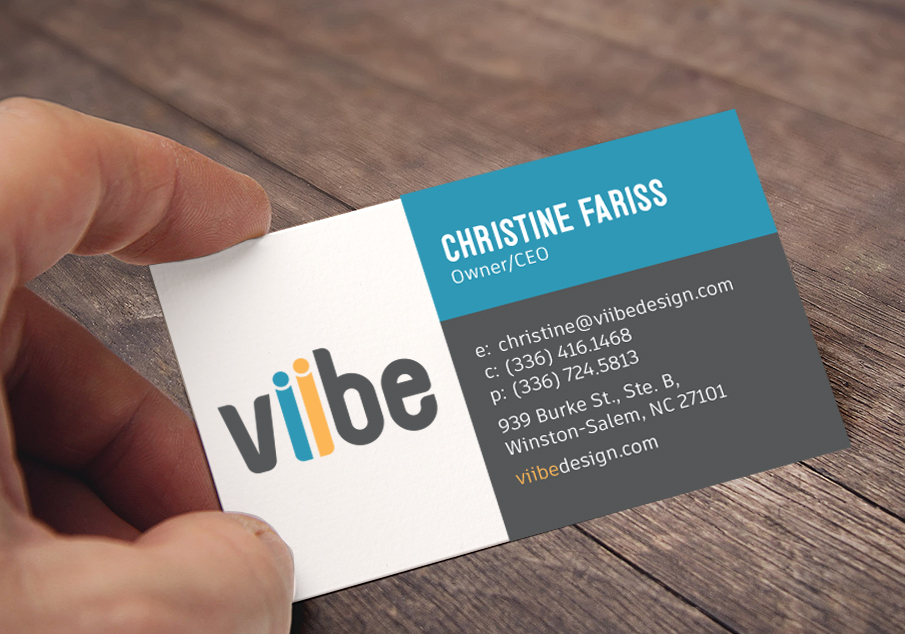
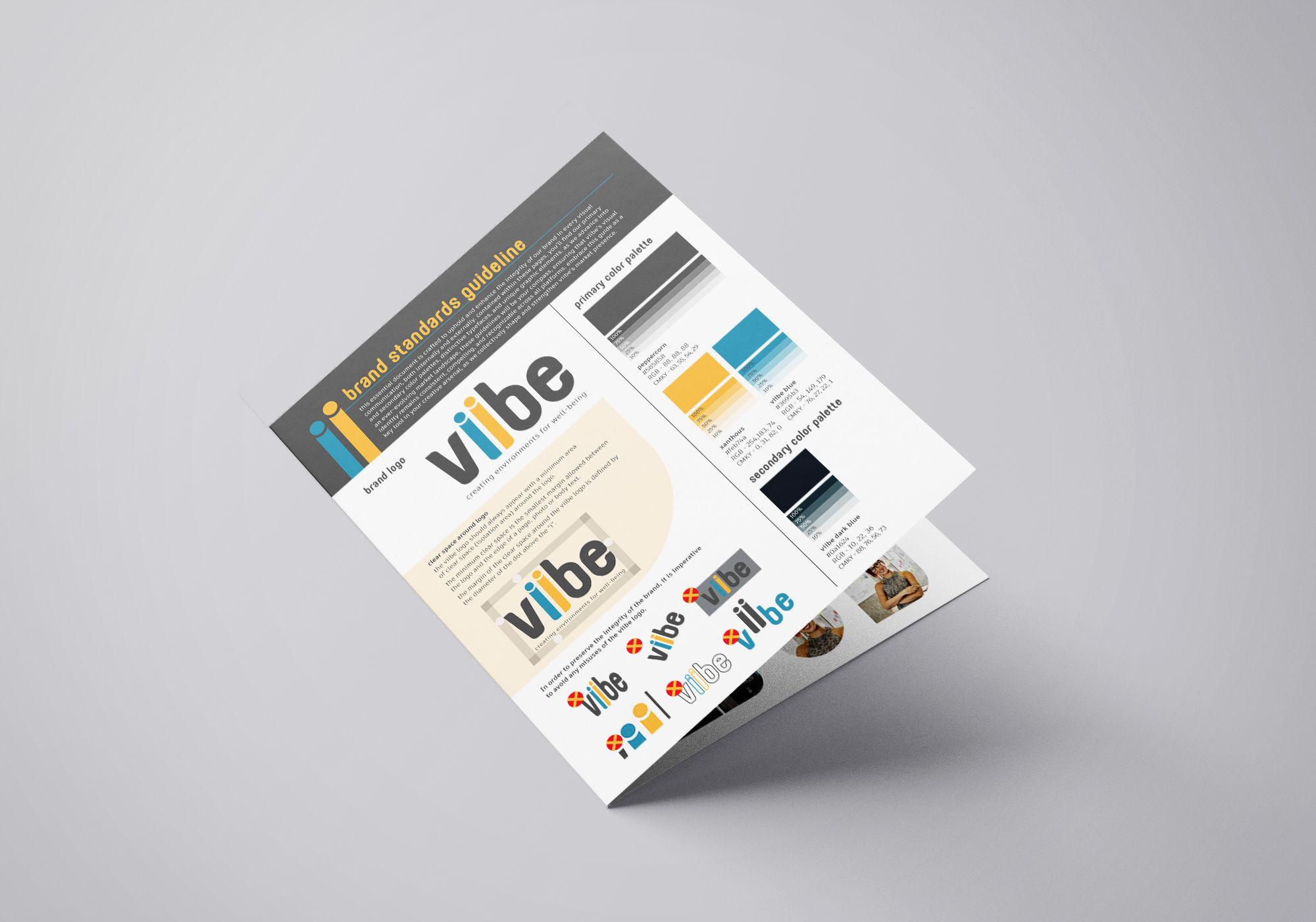
The next phase involved designing a logo that would encapsulate Viibe’s refreshed identity – something bold, innovative, and engaging. Over six weeks, numerous logo concepts were presented and refined, culminating in a distinctive final design provided in various formats for comprehensive brand integration.
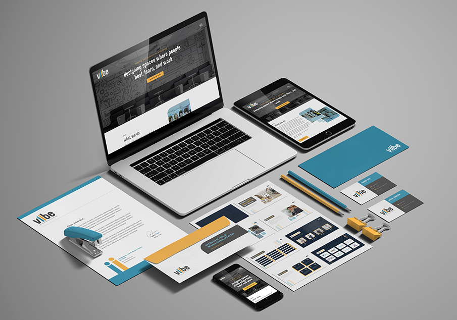
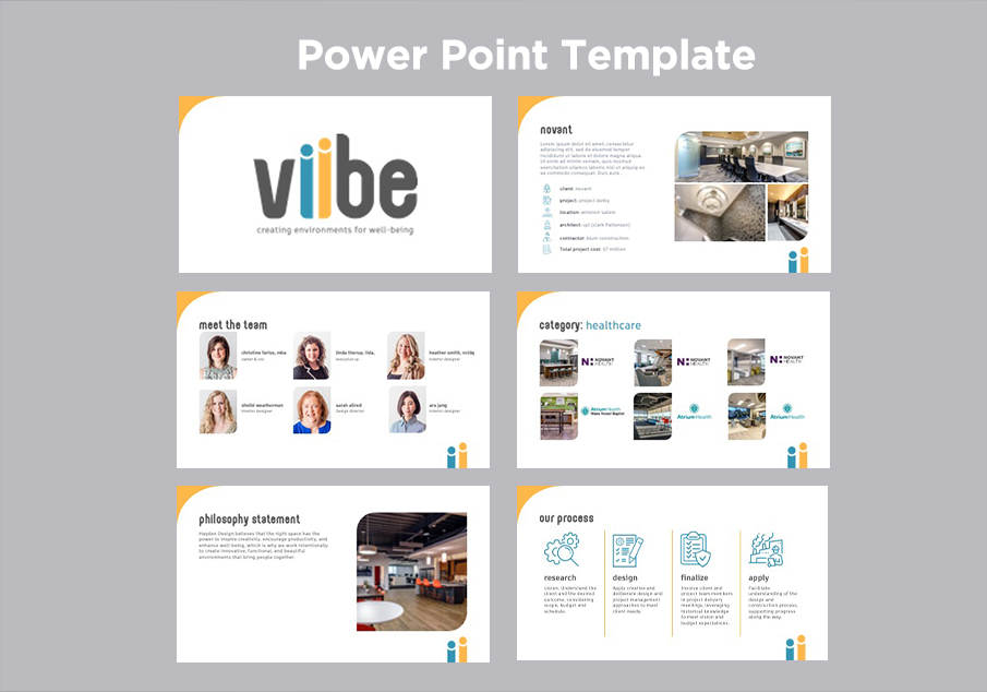
With the logo established, we proceeded to redesign essential brand materials such as business cards, letterheads, and a PowerPoint template, ensuring consistency across all mediums.
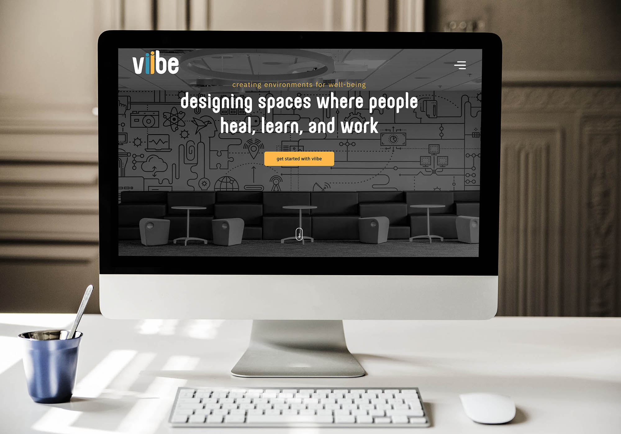
A key component of our strategy was overhauling the firm’s website. The design, echoing the new logo and color scheme, focused on user-friendliness, a comprehensive display of project portfolios, clear service descriptions, and a modern aesthetic.
Outcome:
This comprehensive rebranding initiative successfully repositioned Viibe as a formidable force in the commercial interior design landscape. The new brand identity, resonating with dynamism and modernity, is crafted to sustain and enhance the firm’s prestige for years ahead.
Website: Click here
Brand Standards: Click here
PPT Template: Click here
“I had a fantastic experience working with Don and the Redding Communications team on my company’s rebranding initiative. They exceeded our expectations with a thoughtful approach to renaming, brand colors, branding guidelines, and a user-friendly website. Don’s leadership and the team’s dedication ensured we met our launch timeline. I highly recommend Redding Communications for their creativity and professionalism in turning our vision into reality. Thank you, Redding Communications!”

Christine Fariss
Owner/CEO